


THE USE OF COLOR IN BRANDING AND MARKETING

COLOR PSYCHOLOGY
Colors play an important role in creating the image of companies and in the marketing of products and services. With a well-thought-out choice of colors, a visual connection is formed with the company's values and personality.
Numerous studies have been conducted to find out what is important when choosing a company's color palette; in branding, packaging, websites and other marketing materials. When a company is in the process of marking or re-marking, it is therefore a good idea to use color psychology. The psychology of color is based on the fact - which has been shown through research - that colors can influence people's behavior and decision-making.
It is a fact that different colors cause different impressions and evoke feelings and reactions accordingly. The effect can be different depending on the design and strength of the colors, but also individual, because colors can have different meanings in people's minds depending on taste, culture, traditions and other shaping factors.
As with so many subjective things, there is no one big truth in these studies, but countless studies confirm that the effects of colors and reactions to them follow some crucial principles. Therefore, it is important that companies' color choices are well implemented and reflect the feeling they want to convey. Similarly, an unfortunate choice of colors can evoke a completely different feeling than the one the company had in mind to form an attitude towards it.
WHAT IS COLOR?
Color is our visual perception of the reflection of light from the surface of a surface and is created by the interaction of the frequency distribution of the light and visual perception that takes place in the eye, the optic nerve and the brain.
Research on visual perception indicates that the number of color variations that the human eye can detect is in the millions. Nature has developed the human sense of color in order to make it easier for us to distinguish between objects, detect danger, help in choosing food and be moved by beauty in nature.
Color is created when an electromagnetic field creates waves that travel through the bed, similar to waves on a water surface or sound waves in the air. The light we see are electromagnetic waves in a specific frequency range that have a wavelength ranging from approx. 400 to 700 nanometers, but 1 nanometer is one billionth (10-9) of a meter.
Within this narrow range of wavelengths all the hues of the rainbow can be accommodated; at one end is ultraviolet light with a wavelength close to 400 nanometers, then blue light, then green, then yellow, and at the other end of the spectrum is red light with the longest wavelength. The fact that the human eye only perceives electromagnetic waves in this narrow frequency range has been linked to the fact that these are precisely the waves that are transmitted well in water, and vision first developed in organisms in the sea.
At the same time, the eyes are full of fluid that the light has to pass through before it irritates the nerve sensors on the retina in the fundus. These probes are of two types and are called rods and cones. Letters are much more sensitive to light and are active when it's dark, but then we don't see any colors. The human eye has three types of cones, they are active in daylight and therefore we see colors.
In color psychology, colors consisting of shorter wavelengths are classified as calming or cool (green, blue) while those with longer wavelengths are stimulating or hot (yellow, red). Pure colors occur when the light has almost exclusively the frequency corresponding to the color in question. Wider frequencies create mixed colors, but all colors can be obtained by combining the three primary colors.
THE CHROMATIC COLOR WHEEL
The chromatic color wheel (or color wheel) is a circular diagram of colors first created in 1666 by Isaac Newton. It is based on three primary colors (primary colors) which are red, yellow and blue and three secondary colors (complementary colors) which are green, orange and violet (ie mixing of the primary colours).
A complementary color is the one in opposition to the selected basic color in the color wheel, and there are three complementary colors together, i.e. color together with the two that are on either side of it in the twelve color circle.
Harmony is achieved by using complementary colors or complementary colors according to the color wheel.

CONNECTION OF COLORS
It is very important in which context colors are installed and what meaning is attached to them. Traffic lights are an example of a well-established, global phenomenon where colors have had a fixed role and that interpretation of green, yellow and red has been transferred to all sorts of other things.
An example of the different use of colors depending on the culture is that red is the color of the Republicans, who are far to the right in American politics, while red in our part of the world is a characteristic of social democrats and parties on the left, and of course communism worldwide is red.
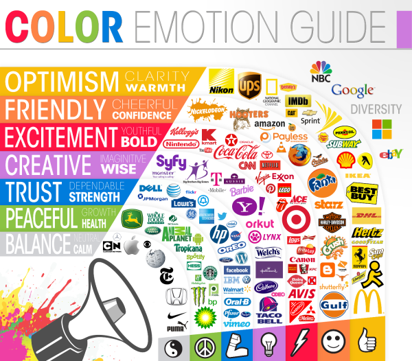
THE MEANING OF THE MOST COMMON COLORS ACCORDING TO COLOR PSYCHOLOGY
🟥 Red
According to color psychology, red is the strongest color and can represent love and affection, excitement, energy, passion and courage, but can also be a sign of danger, anger and violence. Red evokes the strongest emotions, so it makes sense to use it sparingly in a well-thought-out way. Red is often used in CTAs on websites, discount bubbles in newspaper ads and other things that call for a quick reaction, because it captures attention very well. It is also considered to increase appetite and is, for example, widely used as a primary or secondary color in the logos of international companies with fast food and drinks; such as McDonalds, Burger King, KFC, Coca Cola, Pepsi and Tykkvabær!
🟧 Orange
Orange color represents happiness, adventure, enthusiasm, creativity, success and balance. It is a color that enlivens any subject; it captures attention well and, like red, is often used in CTAs on websites. Several Icelandic companies choose to use orange, such as Hagkaup and ON - among the international brands that rhyme well with the color's main meanings are Timberland, JBL, Strava, Harley Davidson, Lufthansa and MasterCard.
🟨 Yellow
According to color psychology, the yellow color's strongest connection is with the sun, it evokes a feeling of warmth and optimism; happiness and serenity, growth and development. Yellow is prominent and the color we notice the most and especially with peripheral vision; it is therefore widely used in safety, traffic and danger signs. Brands often use the color yellow to represent something positive and favorable; stores such as Bónus, Krónuna, ÓB and IKEA can be mentioned, although at the same time there is a reference to the national colors of Sweden. Yellow mixed with other colors is thought to create a more positive user interface, for example on websites, it can be effective in branding due to its ease of being noticed, but it can also be perceived as a ploy to attract the eye.
🌸 Pink
According to color psychology, pink can represent femininity, care, playfulness, innocence, love, happiness and romance. Pink colors are therefore common in brands intended to appeal to women or refer to issues related to them, for example Victoria Secret and the Pink Ribbon. Pink is widely used in the packaging of toys and other goods intended for girls, although today it is seen as promoting ideas about gender stereotypes. Orkan is a brand that uses a distinctive pink color and lots of it; maybe mostly done for fun?
🟩 Green
Green is a refreshing and peaceful color with a strong connection to nature and the environment, outdoor activities and money. Growth, fertility, health and balance are among the positive meanings for green, but it also has negative associations such as envy. Among the companies that choose the color green, Lyfja and Actavis can be mentioned in the health sector; related to environmental issues Sorpa and Endurverällingna, in monetary activities Sparisjódina and TM and companies related to agriculture are then more or less green in color like the Progressive Party.
🟦 Blue
In color psychology, the color blue has a strong connection to the sea and the sky. Power, stability, common sense and professionalism, calmness and trust are among the emotions that blue is meant to evoke and it is the most common color in brands, either in a primary or secondary role. Blue can also have its negative connotations and is associated with depression, feeling cold and male dominance. Tech giants such as Facebook, Twitter and Skype choose blue, and Icelandic companies include Samherja and Brim in the fishing industry; in transport, Icelandair, Eimskip and Samskip are all in blue, and among the media RÚV, mbl.is, Vísir and Fréttablaðið all use blue colors.
🟪 Purple
Purple is a royal color, associated with spiritual and worldly power; luxury, wisdom, insight and intelligence. People with purple color in the year are said to be dreamy and sensitive, even witchy! Purple can stand for ambition, power and wealth, but its excessive use can make people resentful and seen as a sign of arrogance. It goes well with other colors, for example in web banners, as an accent color in graphics and in CTA buttons, for example on Já.is. Examples of international use include Qatar Airways, FIFA World Cup Qatar, Yahoo, Fedex and the Premier League (English football). WOW air is the best-known example of an Icelandic company that was characterized by the color purple.
⬜️ White
In color psychology, white is said to represent innocence, honesty and purity. It also signifies new beginnings and truth, and religiously it is considered to be closely connected to the Almighty. On a slightly more negative note, there are obvious connections to cold and winter. The most common background on websites is white, because with black font it is the best combination for readability. White letters or symbols on a black surface are common as company logos, often with one extra color, for example Deloitte, Adidas and Puma and the Icelandic brands Brimborg and Já.is.
⬛️ Black
Black color can have hidden meanings but also indicates authority, power, discipline, knowledge, elegance, prosperity and sophistication. On the other hand, he can also reflect negativity, conservatism and cunning and evoke emotions such as sadness and anger and is a symbol in that respect. The use of black is popular in global retail and many brands in the fashion world such as Gucci, Prada, Chanel and Nike use black logos and support it eg black background on websites, black and white images with white and gray tones for consistency. Brands that use black logos are usually safe and established, relying on reputation rather than color to demonstrate their strength, stability and value. Used in packaging, black can create a powerful impact and suggest a stylish product or even luxury.
⬜️ Grey
Gray is the color of neutrality and balance, as it lies like a shadow between white and black. He represents strength and stability; is good at fonts, headlines and graphics; suitable for products that should appeal to the masses because it does not have a strong effect on emotions. Apple is perhaps the best example of a brand that uses gray in a lot of interaction with white. Computers and technical products are often in shades of gray, white or metallic colors because neutral colors do not scare anyone away. Car manufacturers use gray in the designs of their brands, such as Toyota, Lexus, Nissan, etc.
🟫 Brown
Brown is a color with a connection to earth and nature and evokes a feeling of comfort, stability and security. In marketing, it is therefore common to use the color brown on the one hand for natural products and on the other hand for the packaging of brown foods such as coffee and chocolate; eg Cocoa milk, Cocoa Puffs, Snickers etc.. Brown is also used in logos and even text on websites on a white background; examples of that are the Te & kaffi website where the logo and text are in brown. UPS is another example; brown in the logo and website text, secondary colors yellow and green that emphasize a natural approach and position UPS as a reliable, down-to-earth company that is what people want when they use shipping services.
Summary of the main symbols of the colors
♥️ Red: fire, love, excitement, energy, activity, passion, courage – danger, anger, violence
🍊 Orange: happiness, adventure, enthusiasm, creativity, success, balance
🍋 Yellow: sunshine, warmth, optimism, happiness, harmony, serenity, agility, growth, wisdom
🌸 Pink: femininity, care, playfulness, innocence, youth, love, happiness, romance
☘️ Green: nature, environment⬜️rfi, outdoors, money, growth, fertility, health, balance - envy
🦋 Blue: sky and sea, power, common sense, confidence, calm, trust – depression, coldness, male power
💟Purple: spiritual and worldly power, luxury, wisdom, ambition, power, wealth - pride
🕊 White: new beginnings, innocence, honesty, purity, truth – ice, cold, winter
⚫️ Black: mystery, power, energy, knowledge, elegance, prosperity, luxury, – negativity, conservatism, shrewdness
🌚 Grey: neutrality, balance, strength, stability
🍂 Brown: earth, nature, comfort, reliability, security

FYLGDU OKKUR
Á SAMFÉLAGSMIÐLUM